Real-time feedback enables miraculous feats!
Imagine standing on an overpass watching the traffic on a freeway below. It’s amazing more accidents don’t occur when you consider the number of cars being piloted, at high speed, in such close proximity to one another.
Imagine the same scene again without real-time feedback. Imagine you could pull a lever that caused all the windows (and windscreens) on all of the cars below to become instantly opaque!
You could cause similar chaos with a less radical experiment too. Imagine that, rather than turning those windows opaque, your lever somehow caused all the windows to impose a two-second delay on their feed of the outside world. With that two-second delay, those drivers would have to slow to an absolute crawl, in order to avoid accidents.
Such is the miracle of real-time feedback.
Sadly, in many work environments, team members either:
- Don’t have feedback at all
- They do have feedback but there’s a significant delay between cause and effect
- Or, they do have feedback but the effect is disconnected from the cause—encouraging behavior that is actually contrary to the interests of the organization
I’ve been presiding over an silent initiative for the last couple of years at Ballistix to try and address this problem—at least with the teams we build in our client organizations.
The obvious result of that initiative is a web application called Nsyteful. The other, less obvious, result are some conclusions we’ve reached (tentatively) about how to provide feedback that’s as close to real-time as possible without distorting the relationship between cause and effect. I’ll try and share some of those conclusions below.
You can see screenshots of Nsyteful as you scroll down the page. It’s a dashboard. It integrates into our clients’ enterprise systems (ERP and CRM) and it visualizes critical information on a large screen in each of our clients’ workspaces. All data is updated every 10 minutes.
Customer service
As is normally the case with dashboards, an Nsyteful board contains a set of widgets. The critical question, when we started designing widgets for our clients’ customer service teams was, what is the feedback we should be providing team members?
It was easy to identify feedback that we did not want to provide. I toured a customer service team once and the owner of the organization boasted to me that he measured the rate at which his CSRs keyed line items into orders and quotes. The advantage of this metric is that it’s easy to measure. The disadvantage is that it misrepresents the value that is being created by CSRs. After all, there are many ways that CSRs can solve customer problems without keying line items! (This is an example of the streetlight effect).
To arrive at our key metric (or key performance indicator), we started with the following assumptions about customer service teams.
- Customer service is a task-based environment—CSRs perform a high volume of relatively simple tasks (as opposed to a low volume of projects, like an engineering team)
- To add value to the organization, CSRs should complete these tasks well within customers’ reasonable expectations (speed is important)
- Quality naturally subsumes under speed—after all, a task is only done when it’s done right
These lead us to the conclusion that the key metric for customer service should be on-time case completion. In other words, the percentage of cases, in a given period, that are completed either on time, or early. Of course, this is the customer service equivalent of DIFOT, in a production environment (the percentage of orders that are delivered in-full, on-time).
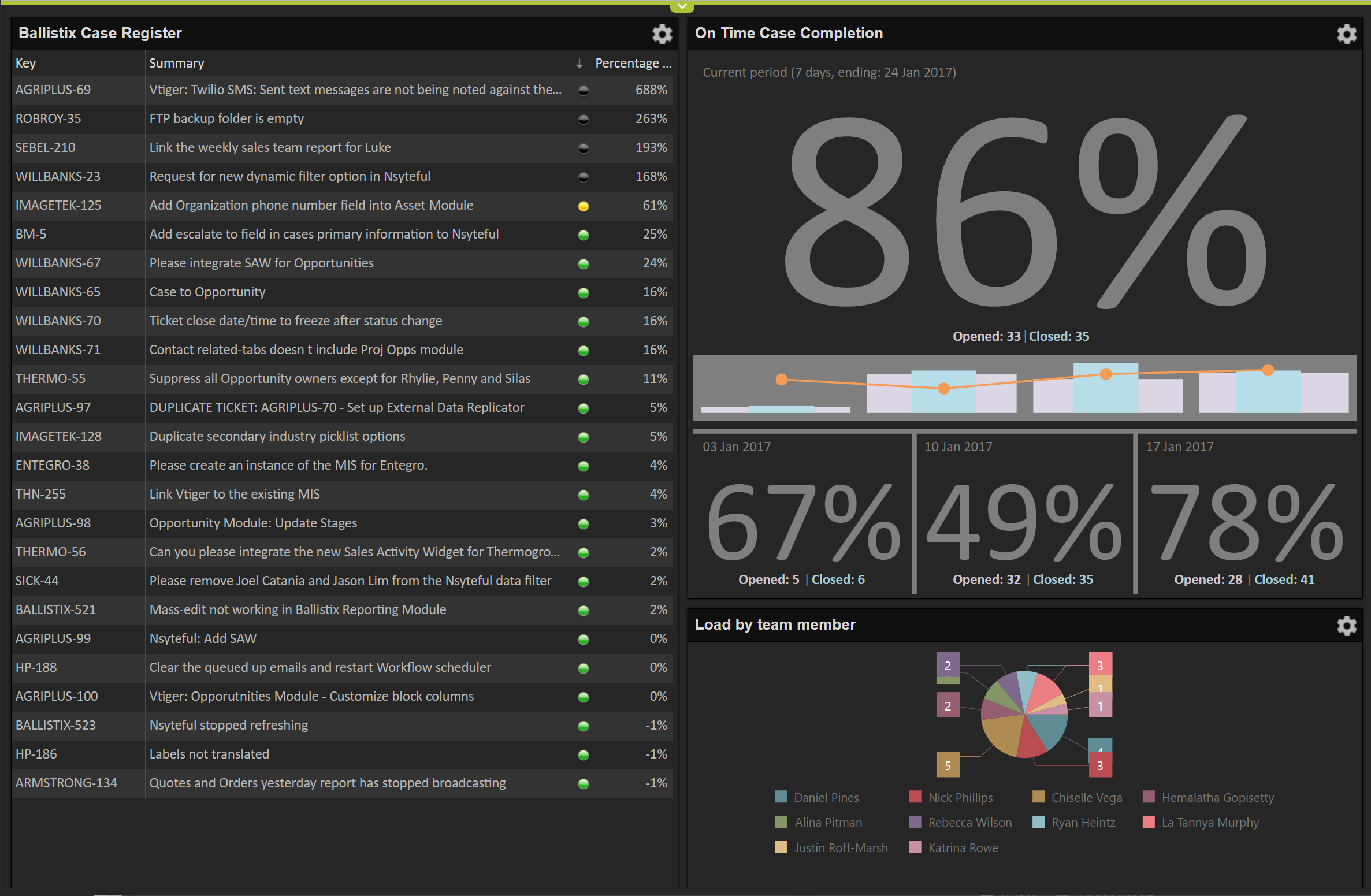
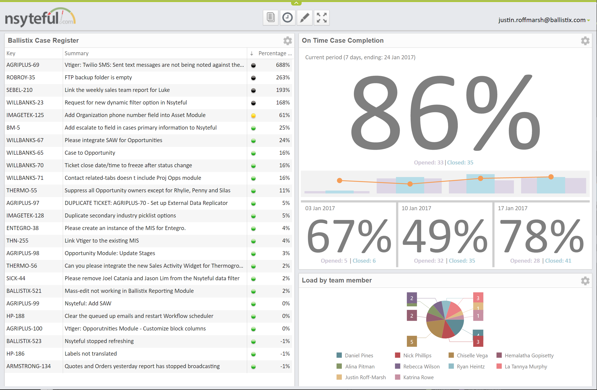
In the TOC world, we call the key metric the goal. We concluded, then, that the goal for our customer service teams should be to maintain on-time case completion (OTCC) at >90%. You can see that metric featured on the right-hand side of the dashboard below.
To enable your team members to focus, it’s critical that you have only one goal. So, if there are a couple of desirable outputs, you need to choose a goal that subsumes these desirables (just as speed properly subsumes quality in point 3. above.) But, in any environment there are also necessary conditions. A necessary condition is a condition that must be met in order for the achievement of the goal to be valid. Often, necessary conditions are obvious (i.e. get dressed before going to work!), but sometimes it’s necessary to go to special effort to visualize information that would otherwise be invisible.
On the dashboard below we are displaying the on-time status of discrete cases (with late cases displaying a black marker), and we are showing the load by team member. The former avoids creating a disincentive to close cases (a case only affects the OTCC calculation when it’s closed!) and the latter avoids an uneven distribution of work across team members.
The practical difference between the goal and necessary conditions is that we’re looking for ongoing improvement in the former, but only compliance with the latter.
The results
We’ve adopted a pretty low-key approach to the deployment of Nsyteful boards. Our general approach is to install a large monitor in teams’ workspaces, configure a page in Nsyteful with appropriate widgets, and provide the team with just a basic overview of what they’re seeing.
In pretty much every case, the impact of the boards has been significant. We consistently see rapid improvements in that critical OTCC number. Most customer service teams start with a number south of 60% (some, a long way south!). But most can get into the high eighties within a couple of months. Progressing from the eighties to the nighties tends to require fundamental changes to teams’ work environment but, even so, most of our clients manage to make it there within three months (assuming that work on those fundamental issues starts on day one.)
The most impressive results, however, are those that occur as a byproduct of the team’s focus on OTCC.
The first change we see is that the positive feedback loop provided by the dashboard results in a much more positive work environment. Individuals become more outcome focused and more collaborative—almost immediately. And teams become easier for supervisors to manage. A number of supervisors have commented that the existence of the one key number have provided an objective baseline for all conversations, preventing individual feelings and opinions from overpowering conversations.
The second change our clients experience is the positive reaction of their customers to the sudden improvement in the efficiency of their customer service teams. In some cases the positive reaction comes in the form of compliments—and CSRs like them! But, in many other cases, the reaction comes in the form of a sudden (and generally unexpected) increase in orders—and the whole organization likes that!
Sales
We’ve waited a long time to try and replicate our experiences with customer service teams in sales environments but, as of about a week ago, our first draft of a sales widget went live with a couple of beta sites. And, the initial indications are that (close to) real-time feedback will provide benefits in sales too (not surprisingly). This widget is appropriate for both inside sales teams, and BDCs (who prosecute opportunities in partnership with field-based BDMs).
We’ve been very cautious with sales environments because sales is more complex than customer service. Sales is more of a project environment. Longer lead times, more variability, and greater uncertainty. This is certainly the case when you are pursuing major sales, which tends to be the case with most of our clients.
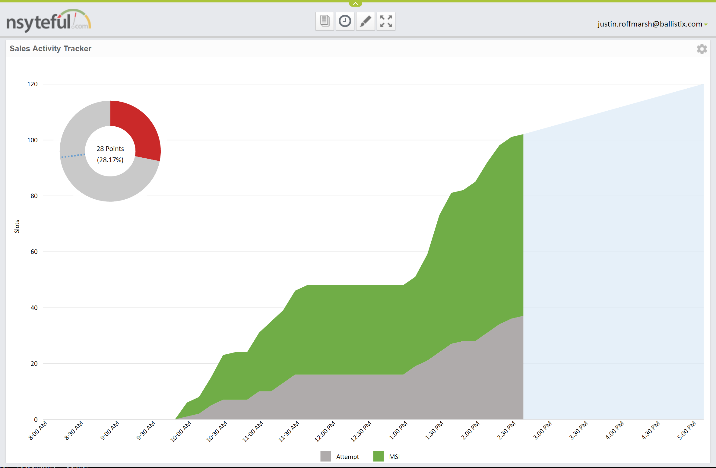
Our first sales widget, below, visualizes two sets of data. On the top left there’s a view of sales achievement (in time, we’ll make this donut chart much more prominent) and along the bottom there’s a chart showing sales activity.
Sales achievement
Obviously, in a sales environment, this is the goal (and activity is a necessary condition). However, in a major sales environment visualizing sales achievement is trickier than it sounds. Remember, we’re looking to provide real-time feedback but, for many of our clients—particularly those doing big-dollar deals, with small sales teams—those sales don’t happen in real time. It can be days or weeks, between deals.
To address this problem, what we’re doing is tracking the completion of stages. Stages are intermediate objectives or waypoints. Typically, a sales workflow will be divided into five or so stages, where each stage indicates some kind of meaningful commitment from the prospect (e.g. agreeing to a web-conference or requesting a proposal). We’re assigning points to each of these stages and summing the points as stages are achieved. 100 points is equivalent, probabilistically, to a sale (a won opportunity).
We’re also weighting the stages by applying a logarithmic scale to the points awarded. This means that completing stages later in the opportunity results in significantly more points being awarded than the completion of early stages.
The goal of the team is to accumulate the number of points, daily, that will translate into the longer-range sales target. The points target is represented by the blue line on the donut chart. And the accumulation of points is represented by the red area of the chart. Both update every 10 minutes, meaning that the team should try and accumulates points at a rate that enables the red area to keep pace with the blue line as it rotates around the chart.
Sales activity
Sales activity is only a necessary condition—but it’s a critical one, for a couple of reasons. First, it’s the primary driver of sales. And, second, most salespeople are used to performing embarrassingly low volumes of activity (and sales supervisors—to the extent that organizations even have them—are accustomed to turning a blind eye to this).
Our policy is that a necessary condition that is not being consistently achieved should be treated as the goal until its achievement has been institutionalized. Once this has occurred, it should be relegated back to necessary condition and focus should shift to the rightful goal.
Casually, we talk about 30 meaningful selling interactions (MSIs) a day as the default sales activity requirement. In practice, however, a little more nuance is required. In some environments there’s no escaping the fact that a lot of call attempts (dials) are required in order to yield a small number of (hopefully productive) MSIs.
The other issue is that not all MSIs are created equal. A two-hour web conference certainly requires more credit than a 10 minute conversation (or an email). Our solution is to count slots rather than interactions and to assign a different slot count to different types of interactions. This adds complexity, obviously, but if you don’t normalize these activity types you’ll get immediate—and strenuous—push-back from sales team members. And, this makes sense, because the feedback, in this case, is distorting the true nature of reality.
In the widget above, the daily activity target is represented by the top-right-hand corner of the chart and the activity accumulates throughout the workday, with MSIs in green and attempts in grey.
Results
Because this widget has just gone live, it’s premature to report on results. But I can say that it has been enthusiastically received by our beta sites. From my perspective, this is a win. I was concerned that the inherent complexity might result in pushback but the initial indications are that salespeople (and their managers) are quick to grasp the cause and effect relationship between the work they are performing and movement of the charts on the wall above them.
And that’s the first hurdle cleared!
Stay tuned for more updates.


