Dashboards are all the rage right now.
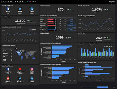
Senior executives, in particular, love the site of a huge monitor, busting with enough colorful charts to put NASA Mission Control to shame.
You know the kind of thing I’m talking about.
But I’m concerned that this kind of display is in danger of giving dashboards a bad name and spoiling what has the potential to be a particularly valuable idea.
Why dashboards?
So, let’s start with the reason for dashboards.
One would hope the reason for installing a dashboard is to make visible information that might otherwise be invisible.
And if we’re discerning when it comes to our definition of information it would make sense to define it as data that has an elevated likelihood of changing a person’s behavior.
This reasoning is in accordance with the origin of the word dashboard. The gauges on your car’s dashboard exist to provide data that isn’t otherwise obvious. And the data communicated by these gauges is stuff you really need to know to avoid bad outcomes (speeding tickets and blown head gaskets, for example).
So, dashboards exist, in both contexts, to modify our view of reality. Absent the carefully curated information served up by the dashboard we are likely to make sub-optimal decisions.
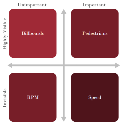
We could imagine a two-by-two matrix, plotting the visibility of data against its importance.
This would help us to make sense of the evolution of the automobile dashboard.
The information in the top two quadrants is provided by the senses. The driver must ration their attention between billboards and pedestrians, but they have all the information necessary to perform that calculus.
The purpose of the dashboard is to surface information that would otherwise be inaccessible. Historically, when cars had manual gearboxes, it was critical for drivers to know the rev count. Today, that data is less important, which explains why the speedometer occupies most of the real estate on the modern dashboard (humans are very poor at estimating speed).
Furthermore, gauges that used to measure things like oil temperature have been replaced with warning lights that disappear entirely when the variable is within its normal operating range.
Dashboards in a business context
It’s customary to approach dashboards from the perspective of the senior executive but this is a mistake.
Given that a dashboard is a decision support system, it would make sense to first support those decisions that have the biggest impact on the performance of the organization.
These are not the decisions made by senior executives (unless those decisions are catastrophically bad!). These are the thousands of decisions made by individual contributors, every day, throughout the organization.
The real potential of dashboards, in a business context, is to modify individual contributors’ views of reality so that they will naturally exhibit behavior that optimizes the performance of the organization.
The power of dashboards is easy to understand when we recognize that there are several reasons why individual contributors’ default views of reality will not result in optimal behaviors.
Here are three reasons why critical information might be concealed:
- Consequences are separated from actions by time
- Consequences are separated from actions by place
- Bad actors (or good actors behaving badly) distort the appearance of reality
Time shift
Sales is a great example of this. Salespeople need to perform a high volume of unpleasant actions in the hope of a pleasant outcome at some point in the distant future. So, unless we find a way to visualize the value that is generated (probabilistically) on a call-by-call basis, there’s a strong tendency for salespeople to avoid picking up the phone.
Place shift
We often see this in production environments. If all individual contributors have a general tendency to maximize production, then operators upstream from (and out of sight of) a bottleneck are likely to respond to news of low production by actually working harder and exacerbating the problem!
Bad actors
And of course, there will always be bad actors who figure out ways to game the system. Perhaps these are customers who phone customer service to place an urgent order, knowing that their phone call will automatically jump the queue (given that most communications are electronic).
Or it might be the well-intentioned (but ignorant) cost accountant who publishes efficiency numbers in the belief that the performance of the system can be maximized by maximizing the rates-of-work of its constituent parts!
It’s easy to see that each of these distortions in individual contributors’ views of reality can lead to bad decisions and negative behaviors. And it should also be clear that these negative behaviors can compound, amplified by the complexity of the modern organization.
Less is more
It’s important to note that individual contributors are generally rational and that they generally have good intuition for their environments.
Unless your organization has a habit of hiring psychopaths (and a few do!) we can assume that negative behavior is more likely to be a consequence of bad information than it is of bad intentions. We can also assume that our dashboards do not have to supplant the evidence of individual contributors’ senses, they just need to modify (or tweak) it.
Our experience is that this tweaking should be limited to a single number. So, the ideal dashboard should not contain tens of gauges, it should contain ONE.
You should identify, and publicize the one number that:
- Causes rational actors to make good decisions (in the context of the entire system)
- Subsumes all other less-critical numbers
A good example of this is the On-Time Case Completion (OTCC) number that our silent revolutionaries use in customer service environments.
We know from experience, that simply publishing this number, causes positive changes in behaviors. We’ve seen cases where the number appears on a screen, without explanation, and operators deduce its meaning for themselves and figure out how to make the number go up, without management intervention.
The other nice thing about this number is that if your customer service team is maintaining 90%+ OTCC performance, then we can be pretty sure that, either:
- The team is performing exactly as intended (meaning that all the other less-important numbers are in good shape too)
- The team is perpetuating a massive fraud (which can’t be sustained for long)
There’s no middle ground!
Of course, this is why production folks love their DIFOT number (Delivery In Full, On Time). It’s the same concept.
The implications for sales
The delayed-gratification problem, referenced above, is a perennial one in sales.
In my experience, in traditional sales environments, the best-performing salespeople can often be the ones who are the most doggedly persistent, rather than the people with whom customers most like to transact.
To the extent this is true, management can respond in two ways:
1. Ensure that salespeople are perpetually on the breadline (or recruit only those individuals who act as if they are)
2. Find a way to reward positive activities with immediate positive gratification so that you can staff your sales team with less mercenary individuals
We are currently experimenting with a number designed to provide immediate positive feedback in sales environments. The number, what we call Expected Dollars, estimates the contribution made by the completion of a stage within an opportunity workflow and displays that number immediately for the sales team. You can read more about how we are doing this here (warning, the math is surprisingly tricky).
I’ll keep you informed on the results of our experiment.
Know when to fold ‘em
So, I’m a fan of dashboards. That shouldn’t be surprising because we’ve built one.
But I’ve been around long enough to know that the problem with metrics (or KPIs) is that once executives get sold on the general idea, they want to assign a number to everyone.
The problem here is that some outcomes are inherently unmeasurable. Like Deming (and Rumsfeld) said, there is some information that is unknown and some that is unknown and unknowable.
Unknowable doesn’t mean difficult to know: it means impossible to know. That means that if you insist on assigning numbers to outcomes that are unknowable the only thing that you can possibly know for sure is that the number will do more harm than good.
The best you can do is to employ smart, well-intentioned people and rely on their intuition and on team dynamics to guide their performance.
Here’s an example of such a role. A Project Leader (as per The Machine) is a person whose sole reason for existence is to manage the delicate interface between customers, salespeople and production teams. An insistence that the contribution of a Project Leader can be collapsed into a single number is an admission of a fundamental lack of understanding of the reason why this role exists!
So, this person should not have a single number, nor should they have a personal dashboard—and that’s quite okay!
Get going!
My advice is to forget about special cases like this and forget about senior executives too. It’s time to go to work with each of your teams and figure out what number—if regularly updated and boldly displayed—will cause your team members to naturally exhibit behavior that optimizes their contribution to the performance of your overall system.

